

SoBo Food Truck
Redefine the "Mexican" food truck and farm to table concept
CHALLENGE
Can a “Mexican” food truck break the mold and be more than the cliché “roach coach?” Can a food truck celebrate a Mexican heritage and a responsible farming culture? Is it possible to do all this and still have fun?
OUTCOME
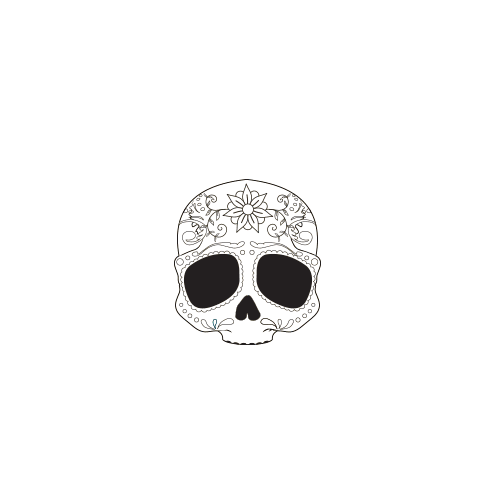
A thoughtful design that centers around a stylized Calavera (sugar skull). Similar to the art prominently featured in Dia De Los Muertos celebrations throughout Mexico and Central America.
DELIVERABLES
Design Strategy
Logo Design
Identity System Design
Website Design
Collateral Design
Truck Wrap
INDUSTRY
Food & Beverage

SUMMARY
SoBo Mobile is the brain child of a Mexican American boy from Arizona and a Canadian farm girl, who believed sustainable agriculture and great food could make something beautiful. The tuck would essentially be a traveling arm of Junco Hill Farm. The farm raises chickens, pigs, cows, and turkeys in a herbicide-free, humane, and healthy environment.
During our design cycle, Allen Wayne created the logo, identity system, the food truck and supporting icons, menus, swag, and the website. Eventually we created a separate identity for the farm itself.
STRATEGY
The project was initiated after design strategy session between Allen Wayne’s Creative Director, Robert Pace and SoBo’s owners Bo Brice and Rebecca Snyder. They agreed that all cliché designs were offensive and completely off the table. No smiling chili peppers to found here. Designs needed to be bold, fresh, interesting, respectful, yet playful.

DESIGN
We researched vintage matador posters, vintage circus art, and traditional art of Mexico and South America. We also looked at textures and colors inspired by Arizona homes and landscapes. This cultural investigation led us to the flowers, scroll work, and icons utilized in Day of the Dead celebrations. For variety and heritage we reach back to Aztec art and patterns.
With the creative tone was set, the team went to work creating an identity system that reflected the “playful heritage” ascetic. Ultimately the sugar skull was selected as the final focal icon. A Playful yet respectful token of remembrance of the founders ancestors.
The truck itself started with an environmental design approach. A texture skin of stucco was created, including all the bumps, cracks, and broken pieces. The logo and supporting iconography was added to the stucco to achieve the final look.

Original Concept Designs
Original Truck Mock-Ups


THE WEBSITE
Based on the SoBo Identity, we created a simple one page website. The site content was organized around key user behaviors. The site is prioritized by the story, the menu, and upcoming locations/events that the truck will be featured at. The site also invites social interaction.

